In my part 1, I covered what Mobile Blazor Bindings (MBB) is, how to get your dev environment setup and create and run your first app. Over the next few posts we’re going to exploring various topics to deepen our knowledge and help us build more feature rich, native mobile apps with MBB.
In this post, we’re going to look at layout and styling. In the web world, we’re used to creating layouts and structure in our apps using elements such as divs, spans and tables. These are then usually enhanced using CSS features such as flexbox, CSS grid or general CSS rules. When it comes to styling, everything we do uses CSS, we don’t have any alternatives. So, how do we do this stuff in MBB? That’s what we’re going to find out.
Introducing Budget Tracker
Before we get started, to give us a bit of focus over the coming posts, we’re going to be working with a simple budget tracker app I’ve created. This will allow us to apply the various features we learn to a real app.
I’m not going to go into loads of detail about the app as our goal here is to learn about Mobile Blazor Bindings, not budget tracking. I’ll give a quick summary just so we understand the layout of the project.
The app is very simple and can currently perform 3 tasks:
- Set a budget for the month
- Record expenses
- Track the remaining balance
This is what the project structure looks like.
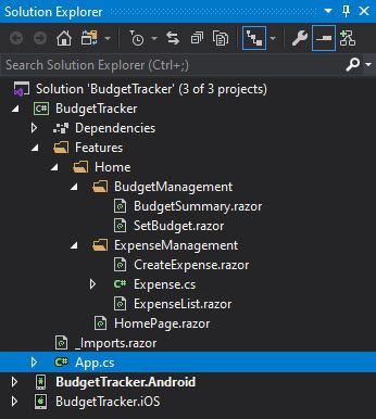
I’m a big fan of feature folders to organise projects, you can see them in use here. There’s a top level feature called Home which has a single page component called HomePage – I tend to postfix any page components with Page so they are easily distinguishable from regular components. Then there are two sub-features, BudgetManagement and ExpenseManagement. The contain regular components which are loaded into the HomePage based on certain logic.
The project is available on GitHub so you can check it out and play with it at your leisure. As I said, we’ll be evolving it over the next few posts so it may change from the above structure over time.
Let’s crack on and starting looking at layout options for our app.
Layout Options
When compared to the web, our options for layouts in MBB are far more structured. As I mentioned in the intro, when creating web apps we tend to use a lot of div elements with CSS to add structure to our pages. But the div element is just a divider, something that marks a section of an HTML document. Other than being a block element (display: block;), it has no predefined abilities. This can be useful as it makes it flexible, however, we have to define what we want a particular div to do every time.
With MBB this is not the case, we have access to a set of predefined structural components allowing us to rapidly create interesting and efficient UI. There are two categories of component for this, page components and layout components.
Page Components
Different page types is not something we’re used to in the web world. We have a single page type, a HTML document, and that’s it. It’s certainly possible to create the kinds of page configurations offered by MBB in HTML, but it involves us having to do all the configuration manually and can take a lot of time.
With MBB, at the time of writing, there are three ready to use page components out of the box (checkout the latest list here).
- ContentPageThe most commonly used type of page. This is a simple component which can display a single piece of child content. For example, a
StackLayoutorGrid. - MasterDetailPageThis page displays a master view, often set to display a menu. And a detail view, set to display the selected menu item. This is a great starting point for multi-page apps.
- **TabbedPage**Allows the developers to define a set of tabs which, when clicked, load their content in to the main view.
There are also two lower level components which can be used to create your own custom page types.
- PagePage is essentially a base class used for creating more functional derived types, all of the other page components here derive from this class. You could use this as a starting point for creating your own custom page type.
- TemplatedPageDerives from the
Pagecomponent above. This component displays full-screen content with a control template and is the base class for theContentPagecomponent.
Layout Components
In MBB, we can use dedicated layout components. At the time of writing there are five layout components available (you can checkout the current list in the docs). They are:
- ContentViewThis is a simple structural component which can display a single child. The child can be any view component or layout component.
- FrameFrame derives from
ContentViewand, by default, displays its child content with a border and shadow making it stand out on the screen. - **Grid**Unsurprisingly, this component allows its child content to be displayed in a grid of rows and columns. This is equivalent to an HTML
tableelement. - ScrollViewThis component allows its content to be scrollable, very useful when displaying long lists or large amounts of text.
- StackLayoutChild components are displayed in a vertical stack, by default. This can be swapped to horizontal by setting the
Orientationparameter. This is the most common layout component I’ve used so far – thedivof the MBB world if you will.
Styling
Now we know about the various options available to use for structuring our pages, what about styling them? MBB offers us two options here, what I’m going to call parameter styles, and CSS styles.
Parameter Styles
Parameter based styling is very similar to what Xamarin Forms refers to as XAML styles. When styling apps using this method we set all style related settings on the component using its exposed parameters.
This is probably easier to understand with an example. Let’s say we wanted to style a Label with a font size of 30 and have it’s text coloured blue. This is how we would do that using parameter styles.
<Label Text="EXPENSES"
       FontSize="30"
       TextColor="Color.Blue" />
We can also set other types of style information for components which is specific to the underlying Xamarin Forms platform. For example, a StackLayout stacks it’s child content vertically by default. We can change this to horizontal by using the Orientation parameter.
<StackLayout Orientation="StackOrientation.Horizontal">
    <!-- ... other code omitted ... -->
</StackLayout>
This method of styling is pretty quick to get going with and it makes it very clear what styles are applied to which components. But one big downside is that we have to set styles everywhere, we can’t just predefine a style for all Labels globally, we have to set each one individually.
Let’s look at the other options now which is much more familiar to us web devs, CSS.
CSS Styles
Please Note: CSS styles don’t appear to work correctly in the current offical release (v0.2.42-preview). In order to use them, I’ve had to clone the repo and build my own NuGet packages to get the latest changes. Hopefully a new release will be out shortly and this step won’t be needed.
Styling components using CSS is probably the obvious go-to option if you’re coming from a web background, and it works pretty much how you would expect it to in MBB. We can create style classes and apply them to individual components or we can use CSS selectors to target all Labels in an app.
We create a stylesheet as normal to contain our styles and we reference it in each page of our app using a special component called StyleSheet which looks like this.
<StyleSheet Resource="BudgetTracker.css" Assembly="GetType().Assembly" />
Don’t put the
StyleSheetcomponent inside any layout components otherwise things won’t work and you’ll probably get a load of weird exceptions – trust me I lost a few hours to this 😭.
Another thing to be aware of is that right now stylesheets need to be at the root of your project, they don’t appear to work when moved into folders. There is a issue tracking this on the GitHub repo.
Using the examples we looked at with parameter styles, what do they look like using CSS. For our first example, we could create a normal style class in our stylesheet with the following rules.
.largeBlueLabel {
    font-size: 30;
    colour: blue;
}
Then apply it to the relevant component using the class parameter.
<Label Text="EXPENSES"
       class="largeBlueLabel" />
Pretty simple right?! But what about handling the Xamarin Forms specific styling such as the orientation example? Well we can do that with CSS as well!
The CSS in MBB is a special flavour which includes a load of specific selectors and properties. Which means we can manipulate setting such as orientation via CSS as well.
.horizontal {
    -xf-orientation: horizontal;
}
<StackLayout class="horizontal">
    <!-- ... other code omitted ... -->
</StackLayout>
In these examples the changes aren’t huge but imagine if we’d set several style parameters on a component, the markup starts to look noisy really quick. Using CSS also allows us to remove the issue we identified with parameter styling where we need to set the same styles over and over again. With CSS we can define the class once and just apply it to whatever components we choose.
Now we have all of this new knowledge about how to layout and style Mobile Blazor Bindings apps, let’s put some of it into action but applying it to the budget tracker app.
Adding Layout & Styling to Budget Tracker
We don’t really need more than one page in our app, at least for now. We’ll keep the default page type, which is a ContentPage, and we’ll focus on applying layout components and styling.
Just for reference, if you check the App.cs you can see where the HomePage component is set as the child of the ContentPage.
MainPage = new ContentPage();
host.AddComponent<HomePage>(parent: MainPage);
Let’s start applying some of these layout components to our app. Currently the app has no layout components at all. This is the code for the HomePage component.
@if (_budget > 0)
{
    <BudgetSummary Budget="_budget"
                   TotalExpenses="_expensesTotal"
                   CurrentBalance="_currentBalance" />
}
else
{
    <SetBudget OnBudgetSet="@((newBudget) => _budget = newBudget)" />
}

@if (_budget > 0)
{
    <Label Text="EXPENSES" />
    <ExpenseList Expenses="_expenses" />
    <CreateExpense OnExpenseAdded="@((newExpense) => _expenses.Add(newExpense))" />
}

@code {

    private decimal _budget;
    private List<Expense> _expenses = new List<Expense>();

    private decimal _currentBalance => _budget - _expenses.Sum(x => x.Amount);
    private decimal _expensesTotal => _expenses.Sum(x => x.Amount);

}
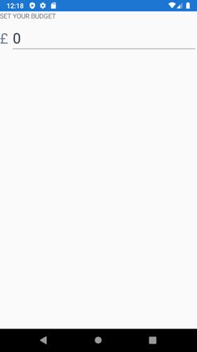
What does this look like when we run it?
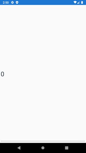
Umm… not the best, I think you’ll agree. As our budget is currently 0 the SetBudget component is being displayed, which looks like this.
<Label Text="SET YOUR BUDGET" />
<Label Text="£" />
<Entry @bind-Text="Budget"
       OnCompleted="@(() => OnBudgetSet.InvokeAsync(_budget))" />
But where are all the other UI elements? All we are seeing is the Entry component – equivalent to an HTML input control – This is because the HomePage component is being displayed in a ContentPage which, as we learned earlier, can only display one child. It seems the last component wins, in this case the Entry component.
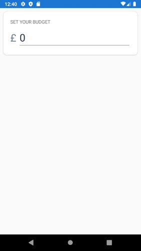
At the very least we need a single top level component to contain all our content. Let’s add a StackLayout to our HomePage and see what happens.
<StackLayout>
    @if (_budget > 0)
    {
        <BudgetSummary Budget="_budget"
                       TotalExpenses="_expensesTotal"
                       CurrentBalance="_currentBalance" />
    }
    else
    {
        <SetBudget OnBudgetSet="@((newBudget) => _budget = newBudget)" />
    }

    @if (_budget > 0)
    {
        <Label Text="EXPENSES" />
        <ExpenseList Expenses="_expenses" />
        <CreateExpense OnExpenseAdded="@((newExpense) => _expenses.Add(newExpense))" />
    }
</StackLayout>
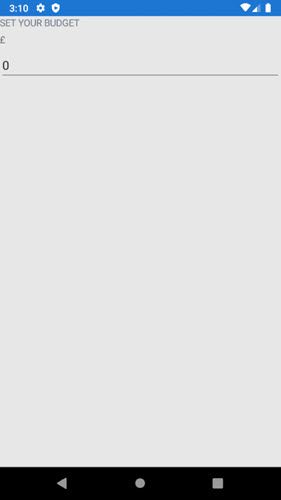
That’s looking a bit better, we can see all 3 UI elements, the 2 Labels and the Entry. As we found out earlier, child components in a StackLayout are stacked vertically by default, but it would be much nicer if the £ symbol and the Entry were on the same line. We can add another StackLayout around the Label and the Entry and set it to display horizontally, which should achieve what we’re after.
<Label Text="SET YOUR BUDGET" />
<StackLayout Orientation="StackOrientation.Horizontal">
    <Label Text="£" />
    <Entry @bind-Text="Budget"
           OnCompleted="@(() => OnBudgetSet.InvokeAsync(_budget))" />
</StackLayout>
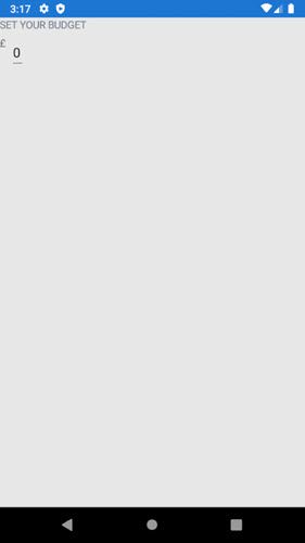
We now have the layout that we wanted but it’s looks pretty naff. Let’s apply some styling to try and improve things a bit.
First off we’ll apply some parameter styles as its a pretty quick way to try things out.
<Label Text="SET YOUR BUDGET" />
<StackLayout Orientation="StackOrientation.Horizontal">
    <Label Text="£"
           TextColor="@(Color.FromHex("718096"))"
           FontSize="30"
           VerticalTextAlignment="TextAlignment.Center" />
    <Entry FontSize="30"
           TextColor="@(Color.FromHex("2D3748"))"
           HorizontalOptions="LayoutOptions.FillAndExpand"
           @bind-Text="Budget"
           OnCompleted="@(() => OnBudgetSet.InvokeAsync(_budget))" />
</StackLayout>
That’s now looking loads better but as I mentioned earlier, there is a lot of markup added just for a few style tweaks. Let’s swap this over to CSS styles and see what it looks like.
We first need to create a stylesheet in the root of the project, we’ll call it BudgetTracker.css and then add a reference to it in the HomePage component.
<StyleSheet Resource="BudgetTracker.css" Assembly="GetType().Assembly" />

<StackLayout>
    <!-- ... other code omitted ... -->
</StackLayout>
We can then add the following styles to our stylesheet and adjust the markup to use these new styles.
entry {
    font-size: 30;
    color: #2D3748;
}

.currencySymbol {
    color: #718096;
    font-size: 30;
    -xf-vertical-text-alignment: center;
}
<Label Text="SET YOUR BUDGET" />
<StackLayout Orientation="StackOrientation.Horizontal">
    <Label Text="£"
           class="currencySymbol" />
    <Entry HorizontalOptions="LayoutOptions.FillAndExpand"
           @bind-Text="Budget"
           OnCompleted="@(() => OnBudgetSet.InvokeAsync(_budget))" />
</StackLayout>
The final change we will make is to add in a Frame component to make our set budget section stand out. We’ll start by adding a new CSS class with some styling, then adjust the markup.
.setBudgetContainer {
    border-radius: 10;
    background-color: #ffffff;
    margin: 10;
}
<Frame class="setBudgetContainer">
    <StackLayout>
        <Label Text="SET YOUR BUDGET" />
        <StackLayout Orientation="StackOrientation.Horizontal">
            <Label Text="£"
                   class="currencySymbol" />
            <Entry ClearButtonVisibility="ClearButtonVisibility.WhileEditing"
                   HorizontalOptions="LayoutOptions.FillAndExpand"
                   @bind-Text="Budget"
                   OnCompleted="@(() => OnBudgetSet.InvokeAsync(_budget))" />
        </StackLayout>
    </StackLayout>
</Frame>
Like other layout components we talked about earlier, the Frame component can only have a single child, so we need to add an additional StackLayout to wrap the existing Label and StackLayout – told you StackLayouts are the div of the MBB world! 😂. With the above changes our app now looks like this.
Our app now looks loads better, obviously we still need to apply layout and styling to the rest of it, but I think this blog post is long enough already! So, if you’ve made it this far then well done and thank you. I’ll carry on with styling the app and you can check it out on GitHub.
Summary
In this post I’ve introduced the layout and styling options available to us in Mobile Blazor Bindings. I briefly introduced the Budget Tracker app we’ll be developing over the course of this series.
Then I talked about the layout options available in MBB, this included all the current page components and layout components. We learned about what each one offers us before moving on to talk about styling. In terms of styling we found out we had two options, parameter styling or CSS. We looked at examples of how to use each one and talked about some potential downsides of parameter styling and how CSS styles could solves those problems.
Finally, we took what we learned and applied to the Budget Tracker app. We added some layout components to improve the look of the page and then added some styles. We first tried parameter styling and then quickly moved to CSS styles.